Designing Around Your TV
How to make your TV work with your decor like a pro!
You’ve worked so hard pulling your living room together in a beautiful Instagram-worthy vignette.
Except. For. The. Television.
Argh.
Whether we like it or not, most of our Living and/or Family Rooms have one, and whether we like it or not, most of our families neeeeed one. Screen time controls in place or not, a television is one of those things that you may not use often, but it’s not exactly portable, nor is it the easiest thing (or practical) to conceal. We’ve collected some living rooms that mastered integrating the TV into their decor. Some of these rooms even gave the telly center stage!
Here are some key points on how to make it work in your room.
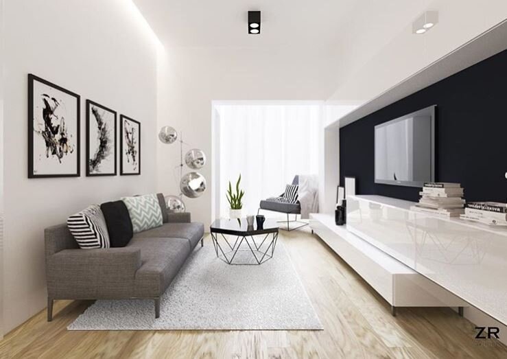
GIVE IT A DRAMATIC BACKDROP
This prominently sized TV works for several reasons: The dark wall cover gives the TV a great modern background and juxtaposes the sleek white modern consoles. The reflective gloss finish on the cabinetry also balances the reflective surface of the TV. Also, notice the horizon line of the artwork directly across.
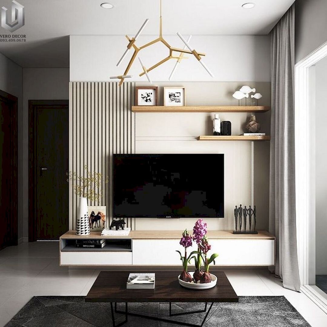
2. USE ITS SCALE TO YOUR FAVOR
This entertainment wall is perfectly balanced by the scale of the TV against the scale of the console beneath it, as well as floating shelves above. Add some geometric elements (our next point) and artful accessory arrangement for a well thought out and put-together wall.
3. PLAY WITH GEOMETRY
Why it works so well: Balanced the TV against the fireplace; added slatted wood backlit with barely-there pendants, and a floating shelf - all for a dramatic and textural focal wall. I’m swooning over here!
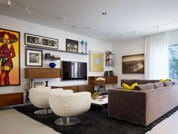
4. USE IT IN YOUR ART COMPOSITION
There’s that balance thing happening again… The long heavy artwork on the left balanced out by the weight of the floating shelf mounted higher than the others. Not to mention the whole wall composition balances the placement of the right-heavy sectional. Result: super interesting and full of character!
5. CONCEAL IT [CLEVERLY]
This black and white living room uses the sliding partition to display and conceal the TV . Using the simple color palette is the secret behind this modernist pad.
6. BUILD IT [IN]
Gently recessed into a cavity above the fireplace, this TV maximizes the close quarters while maintaining the clean lines. without detracting from the rolling barrel vaults in the ceiling. Didn’t notice those, didya?
7. CREATE A SCULPTURAL COMPOSITION
Surround the telly with other sculpture or artifacts for the perfect black grouping.
Here are some more modern living rooms with TV’s to inspire you! Which one is your favorite?


